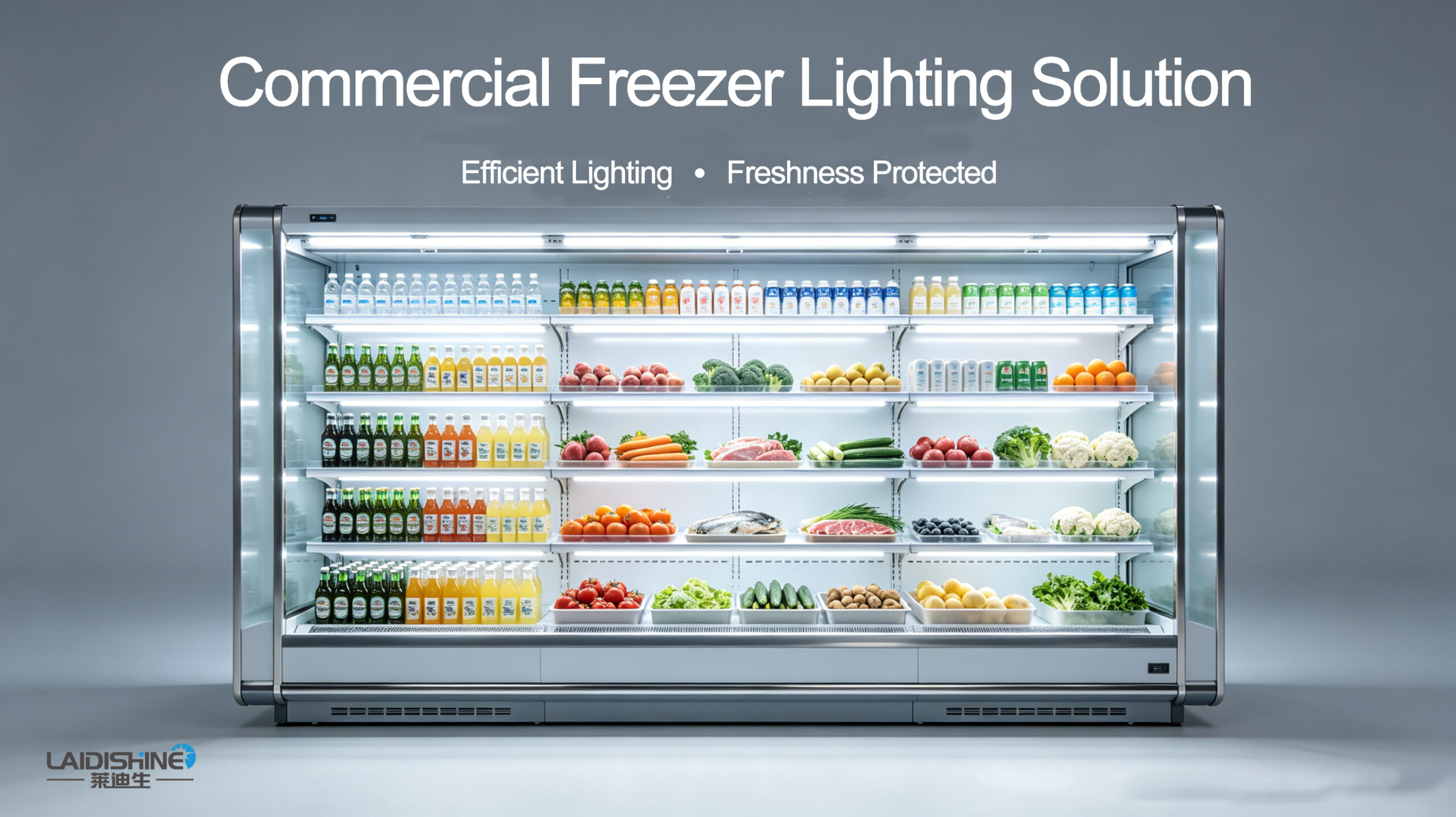

Letzte Woche, Ich ging im Supermarkt einkaufen – und in dem Moment ging ich am Getränkekühler vorbei, Ich war süchtig.
Das leuchtende Orange von frisch gepresstem Saft, das verträumte Rosa-Lila von glitzerndem Wasser, das reine Weiß frischer Milch ... Es sah alles absolut umwerfend aus. Ich hatte überhaupt nicht die Absicht, irgendwelche Getränke zu kaufen, aber ich konnte der Versuchung nicht widerstehen. Ich ging mit einem ganzen Arm voll raus.
Aber dann kam ich nach Hause, Stellen Sie sie auf den Tisch – und ... huh. Sie sahen nicht mehr so toll aus.
Dasselbe Produkt – warum sieht es in der Kühlbox im Supermarkt so unwiderstehlich aus?, Aber sobald man es nach Hause bringt, fällt es völlig in sich zusammen?
Das Geheimnis ist die Beleuchtung. Wie genau sorgen die Lichter von Supermarkt-Kühlschränken dafür, dass Produkte ansprechender und verlockender aussehen – und verleiten Sie so heimlich dazu, mehr zu kaufen, als Sie geplant hatten??
Die Antwort ist CRI.
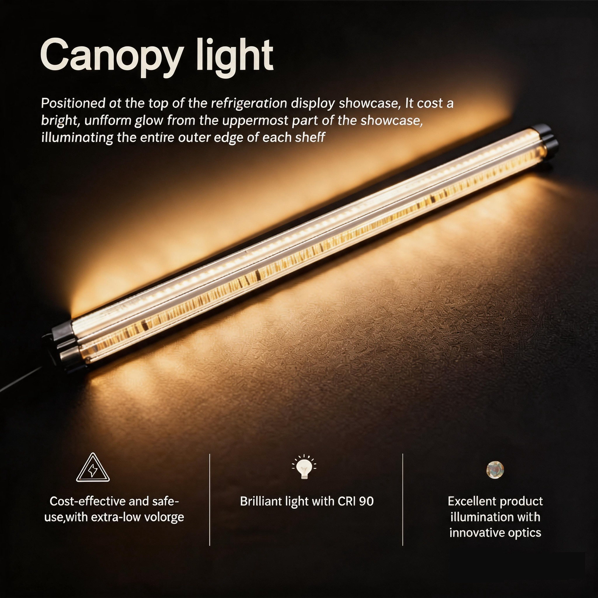
Der Farbwiedergabeindex (CRI) misst, wie genau eine Lichtquelle die wahren Farben eines Objekts im Vergleich zum natürlichen Sonnenlicht wiedergibt – ausgedrückt in Prozent. Je höher der CRI, desto lebendiger und naturgetreuer erscheinen die Farben für das menschliche Auge.
Hoher CRI: Hoch gesättigt & lebendige Farben
Niedriger CRI: Entsättigt & stumpfe Farben
Die goldene Regel für die Supermarktbeleuchtung: Verwenden Sie immer Lichtquellen mit Ra > 80. Verschiedene Zonen erfordern unterschiedliche CRI-Werte, damit jede Produktkategorie optimal aussieht.

1. Fresh Zone – Erfordert einen extrem hohen CRI (CRI ≥ 90, mit besonderem Fokus auf R9)
Dies ist der Bereich, in dem sich eine Beleuchtung mit hohem CRI am meisten auszahlt – denn die Beleuchtung prägt direkt den allerersten Frischeeindruck des Kunden.
1. Obst & Gemüseabteilung – Lieferung frisch gepflückter Produkte.
Beleuchtung mit hohem CRI (CRI > 90) macht das Grün grüner, Rottöne lebendiger, und Orangen sind reicher – für so taufrisches Obst und Gemüse, Frisch vom Bauernhof gepflückter Look.
| Zone | Empfohlene Farbtemperatur | Wirkung |
| Abschnitt für grünes Blattgemüse | 5000K Kaltweißes Licht | Grüntöne wirken lebendiger und üppiger – frisch, natürlich, und voller Leben. |
| Abschnitt mit warmen Früchten (Zitrusfrüchte, Äpfel) | 4000K Neutralweißes Licht | Verstärkt Wärme und Fülle – Farben erscheinen voller und gesättigter. |

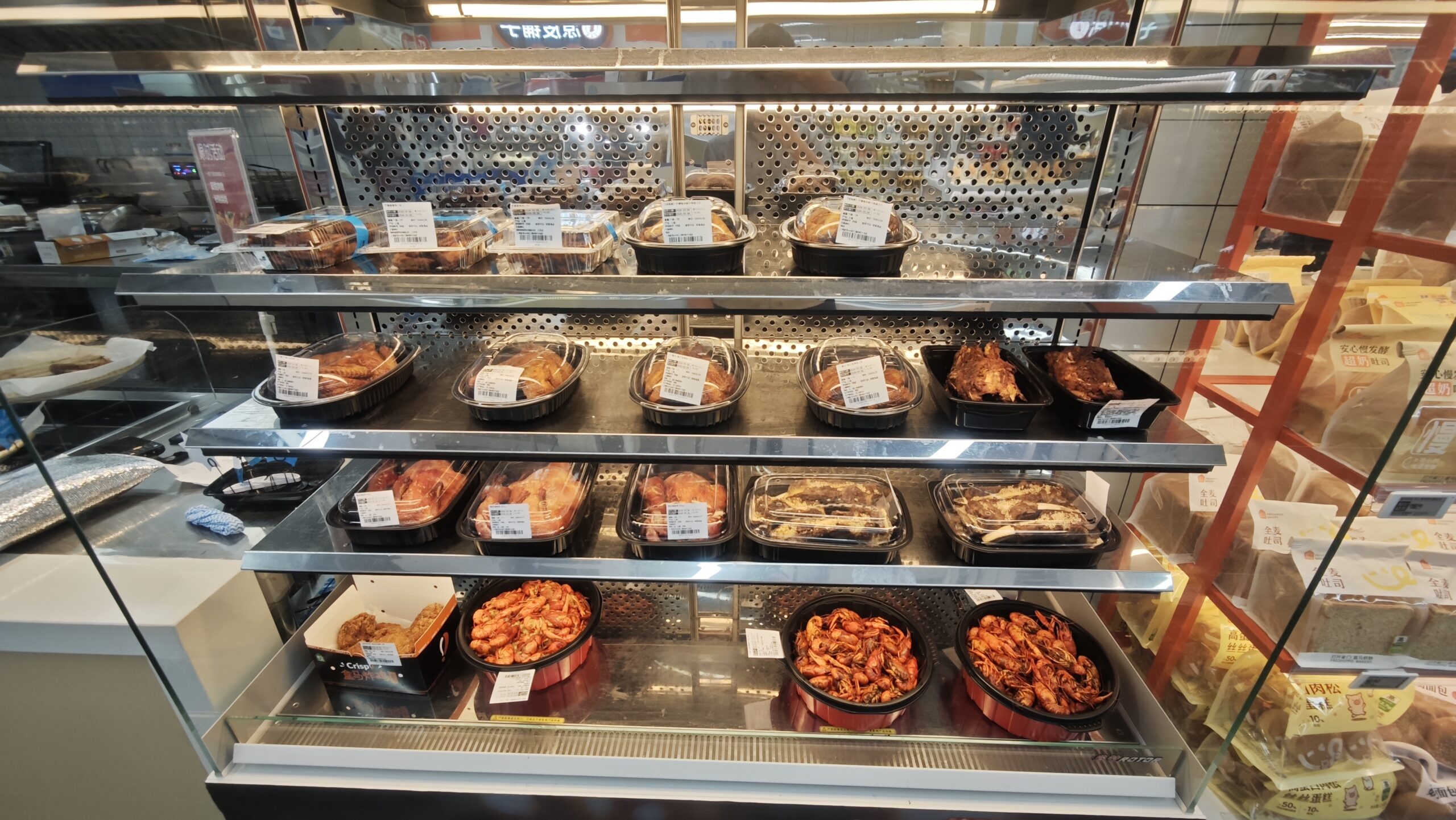
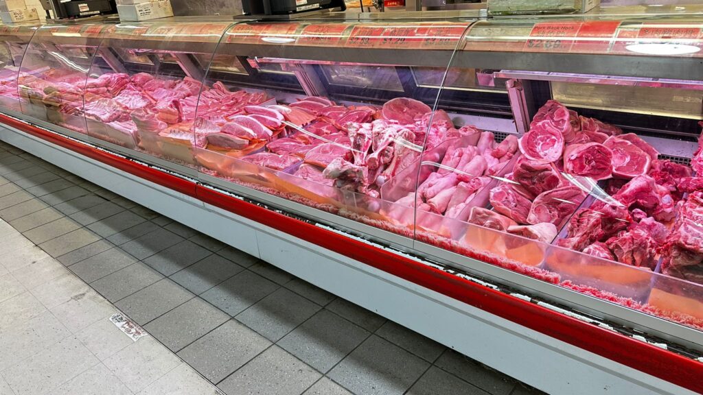
2. Fleischabteilung: Hell, Frisch aussehende Farbe
Die Fleischabteilung ist daR9 (gesättigtes Rot) ist am wichtigsten. Bei schwacher R9-Beleuchtung sieht frisches Fleisch bräunlich oder violett aus – als wäre es verdorben.
Es muss ein hoher CRI verwendet werden + hoher R9 (R9 > 50) Lichter, gepaart mit ~3000K warmweißem Licht – die einzige Möglichkeit, diesen köstlichen Geschmack perfekt nachzubilden, Frischfleischrot.
| Bereich | Empfohlene Farbtemperatur | Wirkung |
| Rotes Fleisch (Rindfleisch, Lamm & Schweinefleisch) | 3000K – 3500K Warmweiß Lklar | Mageres Fleisch erscheint rosiger, reicher, und saftiger. |
| Geflügel (Huhn & Ente) | 3500K – 4000K neutralweißes Licht | Stellt den frischen Rosaton präzise wieder her, Hervorhebung einer sauberen, Just-Cut-Look. |
3. Meeresfrüchte-Abteilung: Cool-Tone-Beleuchtung bietet genau das “Eisfrisch” Fühlen
Der Fischbereich verlangt hoher CRI um das zu präsentieren leuchtend weißes Fleisch Und glitzernde Schuppen – Meeresfrüchte aussehen lassen eiskalt, frisch, und strahlend.
Tipps: Empfehlen Sie ~4000K mit einem kühlen Ton – eine unbewusste Signalisierung “gekühlt” Und “frisch” an Käufer.

4. Bäckerei-Abteilung: Warmes Licht weckt Appetit
Warmer Ton, Beleuchtung mit hohem CRI (2700K – 3000K) bringt damit Brot und Kuchen zum Leuchten unwiderstehlicher goldener Farbton – Kunden direkt ansprechen’ Appetit und Kaufdrang.
Ⅱ. Allgemeine Handelswaren & Lebensmittelgang: Ein hoher CRI ist ein Muss.
In diesen Bereichen werden verpackte Waren ausgestellt (Snacks, Getränke, täglichen Bedarfs, usw.). Die Kernaufgabe der Beleuchtung besteht dabei darin, den Kunden eine gute Lesbarkeit der Verpackungstexte zu ermöglichen und gleichzeitig die Originalfarben der Produkte exakt wiederzugeben.
Wählen Sie Leuchten mit einem CRI von 80+ ist die kostengünstigste Lösung, bietet ein hervorragendes Gleichgewicht zwischen Lichtleistung und Kosten.

Kann die Beleuchtung Ihres Supermarkts wirklich Produkte verkaufen?? Gute Beleuchtung beleuchtet nicht nur Produkte – sie verlängert die Verweildauer der Kunden und weckt die Kauflust. Möchten Sie Ihre Beleuchtung in einen unsichtbaren Verkäufer verwandeln?? Kontaktieren Sie uns Bestellen Sie noch heute eine maßgeschneiderte Beleuchtungslösung und beobachten Sie, wie Ihr Umsatz wächst – die Ergebnisse werden für sich sprechen!